Most deployments don't fail because of the hardware or the software. They fail because nobody thought hard enough about the content. The fix starts with the 3-5-10 rule (3 seconds to grab attention, 5 to 10 second display time, 10 words max per message). After that, it comes down to clear ownership, a CMS your team can actually use, and 5 to 7 solid templates that cover 80% of what you'll ever need to put on a screen.
Why Content Is Where Signage Fails
The pattern never changes. An organization spends six figures on beautiful displays, solid players, enterprise CMS with every feature on the checklist. The demo goes well. Everyone's excited. Three months later, those gorgeous screens are showing the same PowerPoint from launch day. Maybe a clock. Maybe a weather widget nobody asked for.
The hardware works fine. The software works fine. The content is the problem. It's always the content.
Here is what goes wrong in most deployments:
- Stale screens everywhere. Nobody is assigned to update content, so it does not get updated. The grand opening promo is still running in July.
- Inconsistent branding. Every department creates their own slides with their own fonts, colors, and idea of what looks professional. It does not look professional.
- No measurement. If you can't show leadership what the screens are doing for the business, the budget conversation gets awkward. Usually around contract renewal time.
- Wasted production time. Teams spend hours building one-off designs from scratch instead of using templates. Then they do it again next week.
- Wrong content, wrong time. Breakfast promotions showing at dinner. Internal comms on public-facing screens.
This guide covers the fixes: from the foundational rules of content design to the workflows and CMS decisions that keep things running without constant babysitting. Whether you're launching a new network or trying to rescue one that's gone sideways, start here.
The 3-5-10 Rule
If you take one thing from this, make it the 3-5-10 rule. It sounds simple, and it is. Simple is good. Simple is also the thing most digital signage content gets wrong.
3 Seconds
That is how long you have to grab someone's attention. If your content does not hook them in three seconds, they have already walked past.
5-10 Seconds
Maximum display time per content piece. Anything longer and you are losing viewers mid-message or stalling your playlist.
10 Words
Max for your primary message or headline. If you need a paragraph to say it, it does not belong on a sign.
This isn't arbitrary. People aren't sitting down to read your signage. They're walking past it, waiting in line, glancing up between tasks. You don't have their attention. You have a glance. Design for the glance.
Cramming an entire paragraph onto a digital sign because someone in leadership "needs to communicate the full message." If your full message takes 45 seconds to read, it does not belong on a sign. Put it in an email. Put it on the intranet. Signs are for headlines and calls to action, not essays.
The rule forces you to distill your message down to what actually matters. Clean, single-message layouts consistently outperform cluttered ones by 300 to 400% in engagement metrics. OAAA engagement research backs this up, and it lines up with what you'll observe the first time you put a clean slide next to an overstuffed one on real hardware.
Applying 3-5-10 in Practice
- Headlines first. Write the 10-word headline before anything else. If you cannot say it in 10 words, rethink the message.
- One call to action. Visit this URL. Scan this QR code. Go to room 204. Pick one.
- Visual hierarchy. The most important information should be the largest element on screen. Not the logo. Not the decorative border. The message.
- Contrast is king. High contrast text on a clean background beats fancy gradients every single time.
Building Your Content Strategy
A content strategy and a content calendar are not the same thing. A calendar is tactical. A strategy is the reason the calendar exists. Get the strategy wrong and a well-maintained calendar just helps you be consistently ineffective.
Define Your Goals First
This sounds obvious. It rarely is. Ask five people in the same organization what their signage is for and you'll get five different answers. Marketing says branding. Facilities says wayfinding. HR says employee comms. IT says they just want it to stop crashing. They're all right. They're all picturing different screens.
Get those people aligned before a single slide gets made. Primary objectives to sort out:
- Revenue generation: promotions, upselling, product awareness
- Operational efficiency: wayfinding, queue management, meeting room status
- Employee engagement: internal comms, recognition, culture building
- Brand experience: ambiance, storytelling, customer perception
- Safety and compliance: emergency alerts, regulatory messaging, training reminders
Most networks serve multiple goals. That is fine. But you need to know the priority order so you can allocate screen time accordingly.
Know Your Audience
A hospital lobby and a fast-food drive-through need completely different content strategies, and not just different branding. Think about:
- Dwell time. How long are people actually in front of this screen? A waiting room gives you minutes. A hallway gives you seconds.
- Emotional state. People in an ER waiting room are not in the mood for upbeat promotional content.
- Viewing distance. A 10-foot viewing distance needs 1-inch text minimum. A 20-foot distance needs 2 inches. Do the math for your spaces.
- Content literacy. Internal employees might understand jargon. Public-facing screens should not assume any industry knowledge.
Assign Ownership
This is where more deployments quietly die than from any technical issue. If nobody is responsible for content, nobody updates content. It's that simple.
You need a named person, not a department, not a committee, a specific person, who owns content updates for each location or zone. Give them time in their schedule for it. Give them templates so they're not designing from scratch every week. Give them a workflow and training so the process is clear. If internal bandwidth isn't there, consider managed signage as a service instead.
The best content owner isn't the most creative person on the team. It's the most reliable one. Someone who does the update every Thursday, every week, is worth ten talented designers who produce something brilliant once and then go quiet for six weeks.
Creating Effective Content
Great messaging on a poorly formatted screen is still bad content. And perfectly designed content with the wrong message is just expensive wallpaper. This section covers both sides.
Technical Best Practices
Design at the native resolution of your displays. This is basic, and it still gets skipped constantly. 1080p designs on 4K screens. 16:9 content stretched onto portrait displays. Check this before anything else.
| Orientation | Common Resolution | Use Case |
|---|---|---|
| Landscape 16:9 | 1920 x 1080 or 3840 x 2160 | General signage, video walls, menu boards |
| Portrait 9:16 | 1080 x 1920 or 2160 x 3840 | Directory boards, wayfinding, retail endcaps |
| Ultra-wide 32:9 | 3840 x 1080 | Tickers, info bars, stretched displays |
| Square 1:1 | 1080 x 1080 | Specialty displays, social media integration |
- Safe zone: Keep all critical content within 90% of the screen area to prevent edge cutoff on different displays.
- Fonts: Sans-serif only. Helvetica, Arial, Inter, Open Sans. Save the serif fonts for print.
- Minimum font size: 24pt for body text on a standard 55-inch display viewed from 10+ feet.
- Font weights: Limit to two. Bold for headlines, regular for body. That is it.
- Contrast: Dark text on light background or light text on dark background. Minimum 4.5:1 contrast ratio.
- Hierarchy: Use size and color to highlight the single most important element on each slide. If everything is bold, nothing is bold.
The safe zone rule catches a lot of teams off guard. You design content that looks great on your monitor, but when it displays on actual hardware, the edges get clipped by bezels or overscan settings. Building to 90% of the screen area gives you a buffer that works across virtually every commercial display on the market.
Content Templates That Work
Here is a number worth taking seriously: 5 to 7 well-designed templates cover roughly 80% of content needs across most deployments. Retail, corporate, healthcare, education. The types of content people actually need are more predictable than you'd think.
Promotion Template
Product or service highlight with hero image, headline, price or offer, and CTA. Works for sales, events, and seasonal campaigns. These change frequently, so the template needs to make swapping content fast and foolproof.
Data Dashboard Template
KPI cards, charts, or metrics that auto-populate from data feeds. Sales numbers, production stats, safety records. Once configured, they require almost zero manual effort.
Wayfinding Template
Directional layouts with maps, arrows, floor plans, and room or event listings. Often linked to room booking systems. These need to be instantly clear, because confusion at a wayfinding screen defeats the entire purpose.
Announcement Template
Internal comms, news, employee recognition, policy updates. Clean text-focused layout with optional image. The workhorse of corporate signage networks.
Menu Board Template
Food service layouts with categories, items, prices, and dietary icons. Connected to POS for automatic price updates. Essential for any restaurant or cafeteria deployment.
Social Media Template
Live or curated social feeds. Pulls approved posts from Instagram, X, or internal platforms with moderation filters. Adds energy and freshness without requiring manual updates.
Templates do three things that matter: they keep branding consistent even when different people create content, they cut production time from hours to minutes, and they lower the skill barrier so you do not need a graphic designer for every update. Start by auditing every piece of content currently on your screens. Categorize each one. You will find that most content falls into just a handful of types. Build templates for those types first.
Design for Viewing Distance
Your screen is competing with ambient light, nearby signage, and whatever else is happening in the environment. Subtle pastel-on-pastel designs that look gorgeous on your laptop monitor will be completely invisible on a screen in a sun-drenched lobby. Design for the environment, not your desktop.
- 10-foot viewing distance: Minimum 1-inch text height for primary headlines
- 20-foot viewing distance: Minimum 2-inch text height. Double everything.
- High ambient light: Push contrast ratios higher. Avoid medium tones entirely.
- Dark environments: Reduce overall brightness to avoid screen glare that drives viewers away.
Test every layout at actual viewing distance before deploying it. What reads perfectly on a monitor two feet from your face often fails completely at the distances your audience actually encounters.
Smart Scheduling and Dayparting
Showing the right content at the wrong time is almost as bad as showing the wrong content entirely. Dayparting, scheduling different content for different times of day, is one of the highest-impact changes you can make to an underperforming network.
| Time Block | Restaurant Example | Corporate Office Example | Retail Example |
|---|---|---|---|
| Morning (6-10 AM) | Breakfast specials, coffee promotions | Daily announcements, meeting schedule | New arrivals, early bird offers |
| Midday (10 AM-2 PM) | Lunch combos, daily soup | KPI dashboards, project updates | Featured products, flash sales |
| Afternoon (2-5 PM) | Happy hour countdown, appetizer deals | Employee recognition, wellness tips | Clearance items, BOGO deals |
| Evening (5-9 PM) | Dinner entrees, wine specials | Tomorrow's agenda, safety reminder | Last-chance offers, loyalty rewards |
Dayparting alone can increase content relevance by 25 to 35% according to industry benchmarks, and OOH recall benchmarks confirm that well-timed signage consistently outperforms other media channels in consumer recall.
Beyond Time-Based Scheduling
The really interesting stuff happens when you combine dayparting with contextual triggers:
- Weather-triggered content. Umbrella promotions when it is raining. Iced drink specials when the temperature hits 90. This works and it is not as hard to set up as you think.
- Inventory-linked displays. POS integration can automatically pull a promotion when stock drops below a threshold. No more advertising something you are out of.
- Occupancy-aware scheduling. Show wayfinding content when foot traffic is high, brand storytelling when the space is quiet.
- Emergency override. Every single network needs a way to instantly push safety messaging to all screens. This is not optional. Build it into your architecture from day one.
Display Timing Best Practices
How long each piece of content stays on screen matters more than people realize. Too short and viewers miss the message. Too long and your playlist stalls, showing the same slide to people who have already seen it.
| Content Type | Display Time |
|---|---|
| Static promotional slides | 5 to 8 seconds |
| Data dashboards / KPIs | 10 to 15 seconds |
| Video content | 15 to 30 seconds max |
| Wayfinding / directory | 15 to 20 seconds |
| Emergency alerts | Until manually cleared |
Data dashboards get more time because viewers need to scan multiple data points. Emergency alerts stay on screen until someone manually clears them. There is no auto-rotation for safety-critical content. For everything else, shorter is almost always better. When in doubt, cut the display time down rather than stretching it out.
Contextual Triggers
Beyond time and weather, advanced networks are layering in additional contextual signals. Audience analytics sensors can detect crowd density and demographics, adjusting content in real time. Queue management integration can shift messaging based on wait times. Calendar integrations can automatically promote upcoming events as they approach and remove them after they pass. The key is building these triggers into your content workflow so they run automatically rather than requiring manual intervention.
Choosing the Right CMS Platform
Your CMS is the piece everyone underestimates during procurement and resents every day after. Get this choice right and it stays out of the way. Get it wrong and every content update is a small battle.

Must-Have Features
Cloud-Based Architecture
Remote management from anywhere. No VPN nightmares. Automatic updates. Multi-location control from a single dashboard. Remote management is not optional in 2026, it is the baseline expectation.
Granular Scheduling
Per-screen, per-zone, per-time-block scheduling. Not just playlists. Real scheduling with dayparting, date ranges, and recurring rules.
Real-Time Monitoring
Screen status, player health, content playback verification, and alerts when something goes offline. You should not discover a dead screen by walking past it.
API Integrations
Connections to your POS, calendar system, social platforms, data feeds, Slack, SharePoint, and emergency notification system. Walled gardens limit your content options.
Before committing to any CMS, hand it to the person who will actually update content weekly. Give them zero training. Tell them to schedule a slide. If they're stuck after 15 minutes, keep looking. The fanciest features in the demo don't matter if your content owner can't get through a basic update. The Digital Signage Software Guide has a deeper look at the platforms worth considering.
Security and Access Control
Your CMS is controlling what appears on public-facing screens. That is a brand risk if access is not managed properly. Look for:
- Role-based permissions. Admins, editors, viewers, each with appropriate access levels.
- Approval workflows. Content review before it goes live, especially for public-facing screens.
- Audit logging. Who published what, when, and to which screens. You will want this the first time something embarrassing goes live.
- SSO integration. Ties into your existing identity management. No separate passwords to manage.
If you are not sure where your current CMS stands, a software audit can identify gaps and opportunities you might be missing.
Integration Priorities
The CMS should connect to the systems your organization already uses. The less manual data entry required, the more likely your content stays current. Prioritize integrations with your calendar and room booking systems, POS or inventory platforms, social media accounts, emergency notification infrastructure, and internal communication tools. A CMS that requires you to re-enter data that already exists in another system is creating unnecessary friction that will slow your team down and increase the chance of errors.
Dynamic and Data-Driven Content
Static content works fine. The real return on the infrastructure investment, though, comes from content that updates itself, responds to conditions, and doesn't need someone to manually intervene every time something changes.
Data-Driven Content Types
- Social media feeds. Always curated, never unfiltered. Moderation is not optional. Unfiltered user-generated content on a public lobby screen is a bad day waiting to happen.
- Weather and traffic. Local conditions, commute times, outdoor temperature. Useful and appreciated, especially in lobbies and break rooms.
- POS and inventory data. Real-time pricing, stock availability, sales leaderboards. Particularly powerful in retail environments.
- Calendar and room booking. Meeting room status, event schedules, and conference room availability pulled directly from Outlook, Google Calendar, or your room booking platform.
- Emergency alerts. Integration with your building's mass notification system. When an alert triggers, everything else clears and the safety message takes over immediately.
Real-Time Integration Architecture
Dynamic content only works if your integrations are reliable. A social feed widget that crashes every other day or a weather API that shows yesterday's forecast actively hurts your credibility. Build in these safeguards:
- Fallback content. When a data feed fails, show something reasonable instead of a broken widget or error message.
- Caching. Store the last known good data locally so a temporary API outage does not blank your screens.
- Rate limiting awareness. Know your API limits and do not exceed them. This is especially relevant for free-tier weather and social media APIs.
- Regular testing. Test your data connections on a schedule. A widget that stopped updating three hours ago does more harm than good.
AI-Powered Content
AI-adjusted scheduling, where the system learns that your lunch traffic actually peaks at 11:23 on Tuesdays rather than 11:00, is moving from experimental to practical. Several CMS platforms are already there. The organizations with clean data and structured content workflows today will be the ones who benefit first when these features land.
Programmatic content is following the same path. Content that triggers automatically based on inventory, weather, foot traffic, and real-time conditions. The manual calendar doesn't disappear, but it becomes the floor rather than the whole strategy.
Centralized vs. Localized Control
This is one of the most contentious decisions in multi-location deployments. Both extremes fail.
Full central control keeps branding consistent but kills local relevance. Your Dallas location shows the same content as Boston. Nobody finds this useful.
Full local control gives you local relevance but the branding falls apart in weeks. Comic Sans shows up. It always does.
The Hybrid Model
The approach that actually works is a hybrid with clear boundaries:
| Content Layer | Controlled By | Examples |
|---|---|---|
| Brand Templates | Corporate / Central | Approved layouts, color palettes, fonts, logo placement |
| National Campaigns | Corporate / Central | Company-wide promotions, CEO messages, policy updates |
| Regional Content | Regional Managers | Market-specific promotions, local events, regional news |
| Local Content | Site-Level Staff | Store hours, staff spotlights, local community events |
| Emergency Alerts | Both (with override) | Corporate can push system-wide; local can trigger site-specific |
The key is locked templates. Corporate owns the brand elements: logo position, color scheme, font choices. Local teams fill in the variable content within those guardrails. Local gets relevance. Corporate gets consistency. Everyone stops arguing about fonts.
This requires role-based access control in your CMS, which is another reason to take CMS selection seriously.
Scaling Across Multiple Locations
Build your content workflow to handle 100 screens even if you only have 10 today. The systems and processes you establish now determine how painful expansion will be later. That means standardized naming conventions for content files, consistent folder structures in your CMS, documented approval workflows that scale, and a template library that new locations can adopt on day one without reinventing the wheel.
The organizations that scale most smoothly are the ones that treated their first 5 locations as a pilot for 50. They documented everything, trained local teams thoroughly using a repeatable training program, and built enough flexibility into their templates that local customization felt easy rather than constrained.
Measuring Effectiveness and ROI
If you can't measure it, you can't improve it. And you definitely can't justify the renewal budget for it. Most organizations deploy signage and never look at performance data. That's roughly equivalent to running ads and never checking whether anyone clicked.
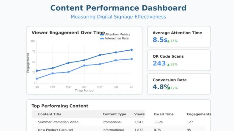
Core Metrics
- Dwell time. How long do people actually look at the screen? This requires sensors or camera analytics, but it is the closest thing to real engagement measurement. If your average dwell time is under two seconds, your content is not connecting.
- Interaction rates. For touchscreen or QR-code-enabled content, what percentage of viewers actually engage? Even non-interactive signage can track QR scan rates as a proxy for engagement.
- Content freshness. How old is the average piece of content in your rotation? If the answer is "I do not know," that is your first problem.
- Screen uptime. Percentage of scheduled hours that screens are actually on and displaying correct content. Anything below 98% needs investigation.
Actionable Measurement
Metrics only matter if they change behavior. Set up a monthly review cadence:
- Pull the data. Playback logs, engagement metrics, uptime reports.
- Identify winners and losers. Which content gets engagement? Which gets ignored?
- Connect to business outcomes. Sales lift on promoted items, sign-up rates for featured services, reduction in wait-time complaints, or fewer repetitive questions at the front desk.
- Kill underperformers. If a content type consistently gets zero engagement, stop making it. Replace it with something that works.
- Report upward. Give leadership a one-page summary with ROI indicators so the budget conversation is easy.
You do not need a sophisticated analytics platform on day one. Start with three things: screen uptime percentage, content freshness (average age of content in rotation), and one conversion metric tied to a business goal. Build from there. Review quarterly at minimum.
A/B Testing
Test one variable at a time. Change the headline, or the image, or the call to action, but not all three at once. Run each test long enough to gather meaningful data, then replace the lower performer.
A/B testing on digital signage is simpler than most people think. Run version A on half your screens and version B on the other half for two weeks. Compare QR scan rates, promo code usage, or whatever conversion metric you are tracking. Over time, this approach builds a library of proven content that consistently outperforms guesswork. The organizations that test systematically improve their content performance by 15 to 25% within the first quarter of testing.
Common Mistakes That Kill Performance
These mistakes show up in almost every underperforming deployment. All of them are avoidable.
1 Information overload. Cramming three messages, a news ticker, a social feed, and a clock onto one screen. The viewers aren't managing incoming flights. One message. One call to action. One screen. The 3-5-10 rule is not a suggestion.
2 Wrong fonts and sizing. That elegant thin-weight font looks beautiful on your monitor from two feet away. From 15 feet on a commercial display, it's illegible. Bold, clean, sans-serif. Every time, no exceptions.
3 Stale content. Nothing signals neglect faster than a screen still running last quarter's promotion. A dark screen is genuinely better than a stale one. At least a dark screen doesn't actively mislead anyone.
4 No content ownership. "Everyone is responsible for content" is a sentence that guarantees nobody updates it. Name a specific person. Put it in their job description. Then give them the time and tools to actually follow through.
5 Ignoring local context. Pushing identical content to every location without considering local audience, environment, or culture. A university campus and a manufacturing floor need different approaches, even within the same organization.
6 Treating signage as a side project. Digital signage is a communication channel. Treat it like one. It needs the same planning and accountability as your email campaigns or website. If it's getting leftover time and leftover budget, the screens will look exactly like that.
7 Skipping the CMS evaluation. Picking a CMS because it came bundled with the hardware, or because the vendor demo looked polished. The demo is always polished. The CMS is what your team uses every day. Evaluate it independently based on real workflows, not sales decks.
8 No emergency content plan. When a fire alarm triggers, what happens to your screens? If you don't know the answer, fix this today. Not tomorrow. Today.
The Future of Digital Signage Content
The next wave isn't about higher resolution or slicker animations. It's about content that needs fewer humans to babysit it.
Interactive and Mobile Integration
The line between digital signage and personal devices is blurring. QR codes were just the start. Near-field communication, Bluetooth beacons, and screen-to-phone handoffs are turning passive displays into interactive experiences. Viewers can scan a code on a display to get more information on their phone, participate in polls, or access exclusive offers. These interactions generate valuable engagement data that feeds back into your content strategy. The content management challenge shifts from "what to show" to "what journey to create."
Sustainability Considerations
Content strategy now includes power management. Smart scheduling that turns screens off (not to standby, actually off) during empty hours. Content designs that use darker color palettes on OLED screens to reduce power consumption. Energy-efficient displays and automated brightness adjustment based on ambient light are becoming standard expectations. It is not just a nice-to-have anymore. It is a line item that facilities teams track, and content management systems are adding power scheduling features to support it.
Emerging Formats
Transparent OLED displays, curved screens, and LED walls with unconventional aspect ratios are creating new opportunities for content design. Touch-capable large-format displays are enabling self-service kiosks that double as advertising surfaces. Sensor-driven personalization, where content adapts based on who is standing in front of the screen, is moving from proof-of-concept to real-world deployment. The organizations that build flexible content templates and structured data feeds today will adapt to these formats much faster than those still manually creating every piece of content from scratch.
- The 3-5-10 rule is non-negotiable: 3 seconds to grab attention, 5 to 10 second display time, 10 words max for your primary message.
- Assign a specific content owner with dedicated time and templates. "Everyone is responsible" means nobody updates anything.
- Build 5 to 7 core templates before creating any one-off content. They will cover 80% of your needs and keep branding consistent.
- Dayparting alone can transform performance. The right content at the wrong time is still wrong content.
- Choose your CMS based on the untrained user test, not the feature checklist. Ease of use beats feature count every time.
- Use a hybrid content model with locked templates. Corporate gets consistency. Local teams get relevance. Nobody gets Comic Sans.
- Measure what matters: uptime, content freshness, and at least one conversion metric. Review monthly. Kill underperformers.
- Refresh content weekly at minimum. Stale screens actively damage your brand more than no screens at all.
Further Reading
If you want to go deeper on any of this:
- Digital Signage Strategy Guide covers the strategic planning framework for your entire deployment, from initial objectives through long-term scaling.
- Digital Signage Training Guide walks through how to build a training program that gets your team up to speed on content creation, scheduling, and troubleshooting.
- Retail Digital Signage Guide focuses on the unique requirements of retail environments, including POS integration, promotional scheduling, and shopper engagement strategies.
Jordan Feil is an independent digital signage consultant with 17 years of industry experience. He has worked as a product manager at Navori Labs, a technical account manager, and a global marketing director before founding JAF Digital Consulting. He works with operators, vendors, and integrators on strategy, software selection, network audits, and go-to-market. No commissions, no vendor relationships that shape what he recommends.