
Digital signage content isn’t just decoration, it’s your direct line to the people you’re trying to reach. It’s how you inform, guide, promote, and influence in real time.
Whether you’re helping someone find their way, spotlighting a product, or sharing urgent updates, your content is what makes the screen matter. It’s what turns a static display into a dynamic communication tool.
This guide will walk you through the fundamentals of creating digital signage content that actually works. Content that’s clear, intentional, and built to drive action, not just fill space.
The Fundamentals of Digital Signage Content
Before you dive into design, you’ve got to get the fundamentals right. Great digital signage content doesn’t just look good. It fits the screen, reads fast, and delivers the message without wasting space.
Size and Resolution: Prioritize Clarity
If your content looks stretched, blurry, or gets cut off, your audience tunes out—fast. Here’s how to keep things clean and sharp:
-
Match the resolution: Design at the screen’s native resolution. Most displays are either 1920×1080 (Full HD) or 3840×2160 (4K UHD).
-
Stick to the aspect ratio:
-
Landscape = 16:9
-
Portrait = 9:16
Don’t try to force one format into another.
-
-
Use the safe zone: Keep essential text and visuals away from the edges. Design within 90% of the screen area to avoid cutoffs.
💡 Pro Tip: If you’re designing for multiple screens or a video wall, make sure resolutions and aspect ratios match. Inconsistencies will break your layout fast.
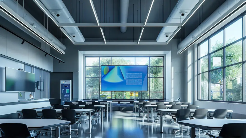
Screen Orientation: Design for the Space
Landscape and portrait aren’t just rotated versions of the same thing. They have different use cases—and your content needs to adapt.
-
Landscape (16:9): Best for menus, videos, and wide-format promotions.
-
Portrait (9:16): Perfect for narrow areas like lobbies, elevators, or hallway displays.
🎨 Design Tip: Don’t just spin your layout 90 degrees. Build separate templates for each orientation. It takes a little more time but delivers way better results.
Understanding Your Audience: Know Who You're Talking To!
Before you design anything, ask yourself: Who’s actually looking at this screen?
Great content starts with the audience. Not your brand guidelines. Not your favorite font. Your viewers.
Start with Real Insight
Use audience analytics, foot traffic data, or just old-fashioned observation to figure out who’s in front of the screen. Are they rushing through? Sitting and waiting? Shopping with kids? On a tight schedule?
The more you know, the sharper your message.
Match the Message to the Moment
Different environments call for different content. For example:
-
Retail: Highlight promos, limited-time offers, and product benefits. Keep it bold and time-sensitive.
-
Healthcare: Prioritize clarity. Wayfinding, wait times, service updates — anything that reduces stress and confusion.
-
Corporate: Use internal screens for announcements, recognition, or culture-building. Keep it short and relevant.
Content only works if it connects. And connection starts by understanding what your audience needs, not just what you want to say.
Boost Your Signage , Get Expert Help!
Best Practices for Digital Signage Content
Before you dive into visuals, get the basics right.
Size & Resolution: Clarity Comes First
If your content is blurry, stretched, or gets cut off, you’ve already lost the viewer. Here’s how to keep everything sharp and clean:
-
Match the resolution: Design for the screen’s native size. Most are 1920×1080 (Full HD) or 3840×2160 (4K UHD).
-
Respect the aspect ratio:
-
Landscape = 16:9
-
Portrait = 9:16
Don’t force horizontal content into a vertical frame (or vice versa).
-
-
Use the safe zone: Keep key text and visuals inside 90% of the screen area. It prevents important elements from being cut off by screen bezels or overscan.
💡 Pro Tip: Designing for a video wall or multi-screen setup? Keep aspect ratios and resolutions consistent. Mismatches will wreck your layout.
Screen Orientation: Design for the Real World
Landscape and portrait aren’t just flipped versions of the same layout. They serve different purposes and need their own design approach.
-
Landscape (16:9): Ideal for menus, videos, and wide-format promotions.
-
Portrait (9:16): Works best in tight vertical spaces like lobbies, elevators, and hallways.
🎨 Design Tip: Don’t just rotate your design. Build unique templates for each orientation. The extra effort pays off with better visuals and stronger impact.
Content Templates for Digital Signage
You don’t need to start from scratch every time you update a screen. Templates are the secret to scalable, consistent digital signage content. They save time, reduce errors, and make it easier for teams to keep messaging on brand.
Here are a few proven formats that work in just about any environment:
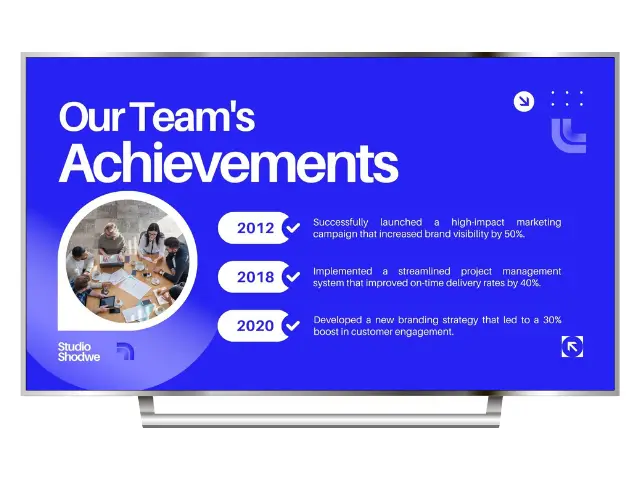
1. Event Announcements
Great for promos, community updates, or internal comms. Keep it simple: bold headline, clear date and time, eye-catching image.
Example:
Summer Sale Starts Friday
Up to 40% Off In-Store
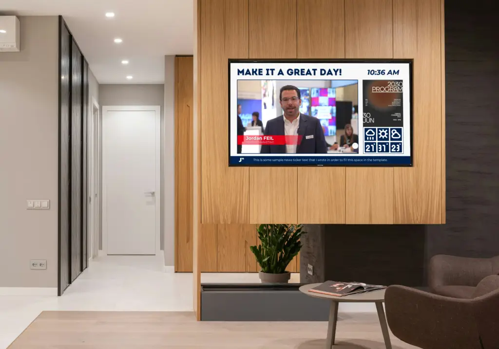
2. Live Social Media Feeds
Showcase real-time engagement from Instagram, X (formerly Twitter), or other platforms. It adds freshness and social proof to your screens.
💡 Pro Tip: Use moderation tools to avoid accidentally displaying off-brand or off-topic posts.
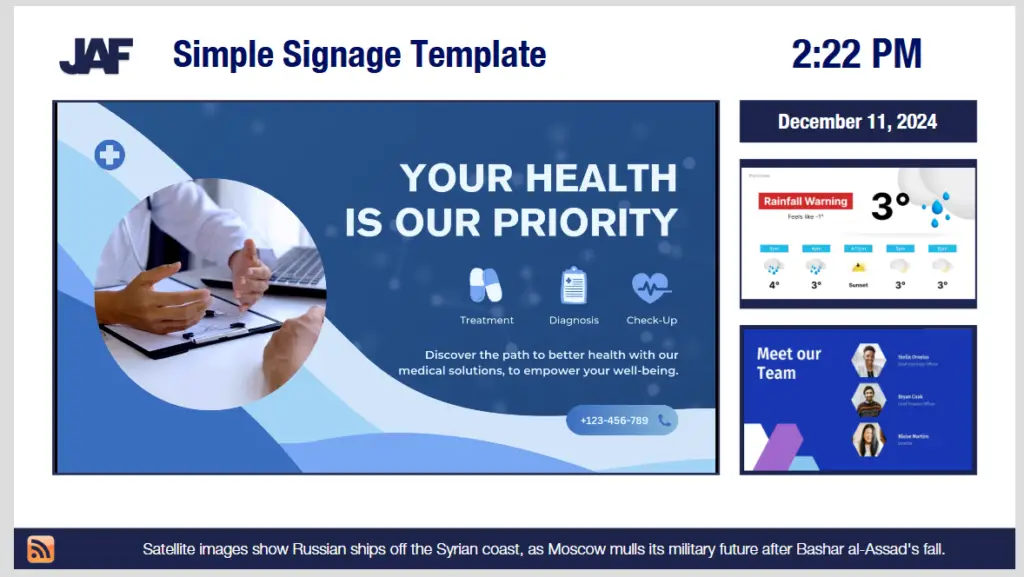
3. Weather & News Blocks
Add value at a glance. Quick forecasts or headline snippets give people a reason to stop and check your screen—even when they’re not looking for an ad.
📍 Design Tip: Tuck this content into a sidebar or corner so it supports—not competes with—your main message.
4. Wayfinding & Directional Signage
Use simple icons, clear arrows, and minimal text. This format is ideal for campuses, malls, healthcare, and large venues where clarity is everything.
🎯 Bonus: Use consistent colors and symbols across your signage network to reduce confusion and help people navigate faster.
Timing and Playlists
Good content is only half the equation. The other half is timing. If your screens are showing the right message at the wrong time, you’re wasting screen space.
Keep It Short. Make It Stick.
Your audience isn’t camped out in front of the screen. They’re walking by, waiting in line, or glancing up between tasks. That means your content needs to land fast.
-
Static slides: 5 to 10 seconds is the sweet spot
-
Animated content or video: Keep it between 10 and 15 seconds — long enough to engage, short enough to hold attention
If your message takes longer to read than it takes to walk past the screen, you’re losing people.
Use Playlists to Stay Relevant
Playlists let you rotate content automatically, keeping things fresh without manual updates. But smart scheduling is where things really pay off.
-
Dayparting: Show content based on time of day. Morning menus, afternoon promos, evening events — each gets its own spotlight.
-
Contextual content: Tailor what’s on screen based on the location, the audience, or even the weather. Cold outside? Push hot drinks.
-
Seasonal updates: Align your content with holidays, school calendars, or local events. Plan ahead so you’re not scrambling last minute.
Your playlist isn’t just a queue. It’s your content strategy in motion.
Book a free consultation today
Common Mistakes in Digital Signage Content
Even with the right tools, it’s easy to get digital signage content wrong. Here are the usual suspects — and how to steer clear of them:
1. Information Overload
Trying to cram too much into one slide? That’s the fastest way to lose your audience. Stick to one clear message per screen. Less is almost always more.
2. Bad Fonts or Weak Contrast
If people can’t read it, it’s useless. Avoid thin fonts, overly stylized text, or low-contrast color combos. Always test your content on the actual screen before going live.
3. Low-Quality Visuals
Blurry photos or stretched logos make your brand look sloppy. Use high-res images, and always design at the screen’s native resolution to avoid pixelation.
Clean visuals, sharp text, and a clear message — that’s your baseline. Miss any of those, and even the best strategy won’t save the content.
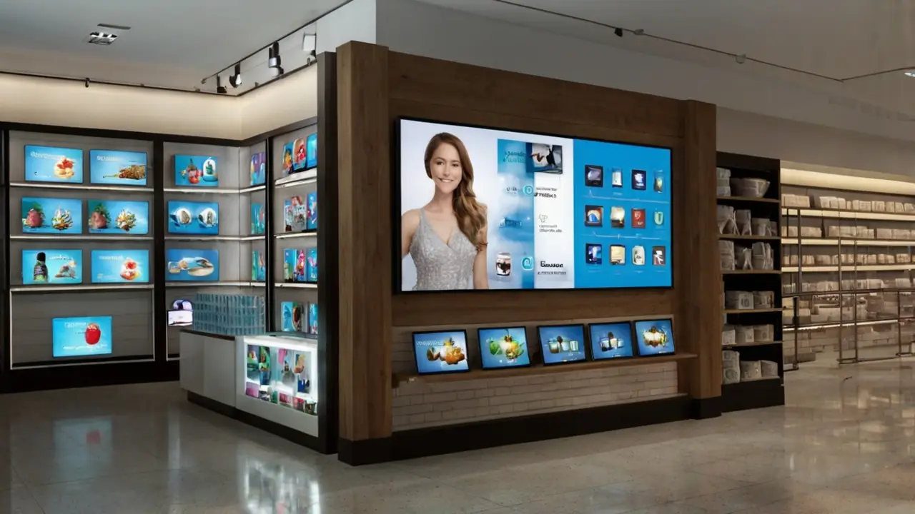
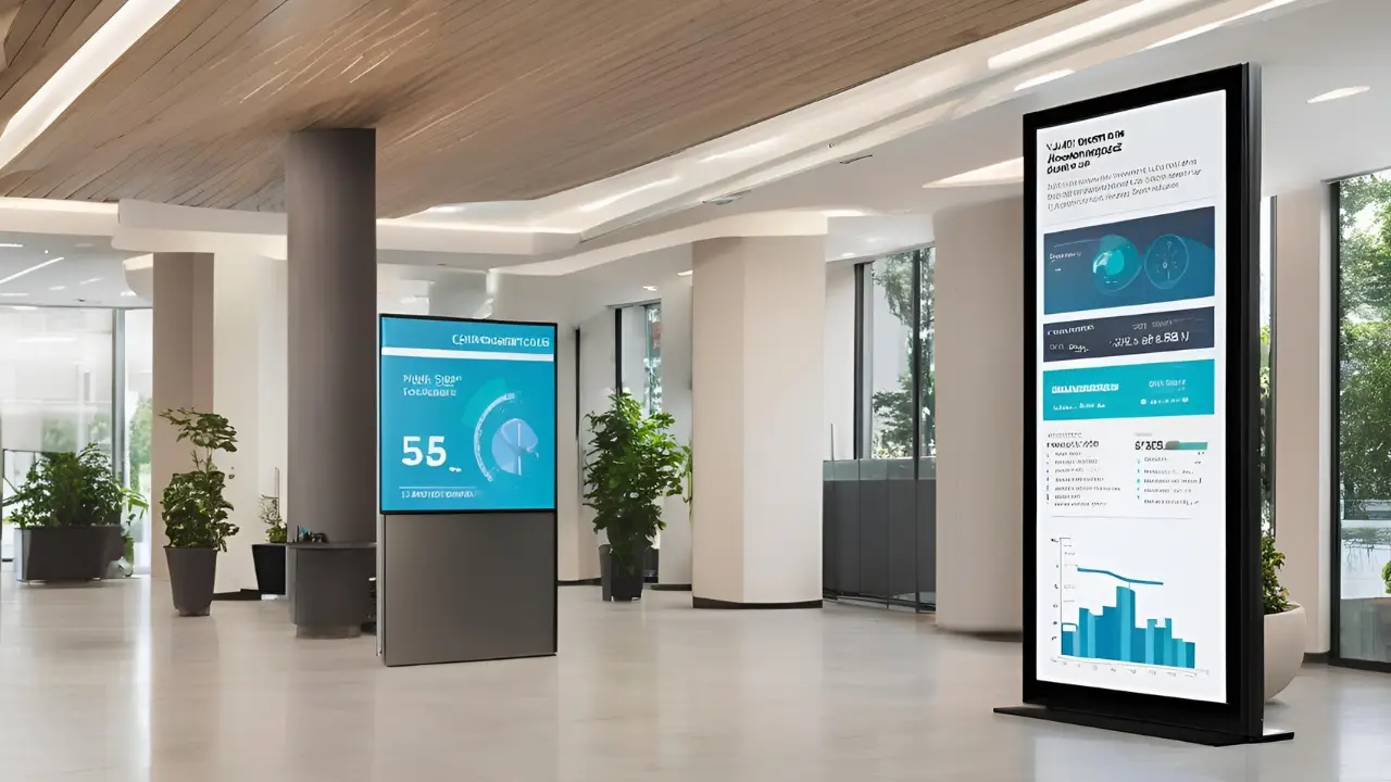
Optimizing Content for Different Displays
Digital signage isn’t one-size-fits-all. Your content needs to flex depending on where it’s going and what kind of screen it’s on.
-
Large displays: Use rich visuals and bolder layouts. These screens are built to grab attention, so give them something worth looking at.
-
Smaller screens: Prioritize clarity. Keep text tight, use strong contrast, and get straight to the point. No one’s squinting at a hallway directory for fun.
Match the Specs or Wreck the Experience
Every screen has its own resolution and aspect ratio. If you’re not designing for them, your content will end up stretched, cropped, or just plain broken.
-
Always match your content to the screen’s native resolution
-
Use separate layouts for portrait and landscape formats
-
Test everything on the actual display type before rollout
Smart content adapts. It looks sharp no matter where it shows up — from massive video walls to tablet-sized room signs.
Design once, adjust often. That’s how you keep your signage looking pro across every screen in the network.
Video Walls: Big Impact, Bigger Responsibility
Video walls turn heads. Whether they’re in a retail flagship, a corporate lobby, or a mission-critical control room, they’re built to impress. But pulling off great content across multiple displays isn’t just about dropping in a video and hitting play. It takes planning, precision, and the right tools.
Why Sync Matters
A video wall is only as good as its content delivery. If your screens are out of sync, stretched, or showing cropped visuals, the whole thing falls apart. What should feel immersive ends up looking amateur.
Let’s break down what it takes to get it right.
Content That Actually Fits
Video walls aren’t just bigger — they’re different. Here’s what to plan for:
1. Resolution
You’re dealing with a massive pixel canvas. A 2×2 wall of 1080p screens needs content at 3840×2160 pixels minimum. Create your content at native resolution, or risk looking blurry on a big scale.
2. Aspect Ratio
Forget 16:9. Most video walls end up with custom dimensions — like 3×1 or 4×2 — which means your content needs to be designed specifically for that shape. Otherwise, you’ll end up with black bars or awkward crops.
3. Bezel Compensation
Even with ultra-thin bezels, those screen edges can break up your content. Use your media player or video wall processor’s bezel compensation tools to adjust visuals so they flow seamlessly across all displays.
Pro Tip: Keep Content Movement Slow and Smooth
On large video walls, fast pans or chaotic animation can become overwhelming. Keep transitions clean, motion purposeful, and use scale to highlight key messages — not just to show off.
Measuring and Optimizing Content Effectiveness
Once your content is live, your job isn’t done. To keep your screens working as hard as they should, you need to measure performance and make adjustments based on real data…not guesswork.
Use the Metrics That Actually Matter
Most solid digital signage platforms offer built-in analytics. Don’t ignore them. Focus on data points like:
-
Dwell time: How long people are looking at the screen
-
Interaction rates: For touchscreens or QR code scans
-
Demographics: Who’s seeing your content, if your system supports it
-
Playback frequency: How often content runs — and when
This data tells you what’s working and what’s just taking up space.
Test, Learn, Repeat
A/B testing isn’t just for websites. Try running different versions of your content with small tweaks:
-
Short vs. long headlines
-
Light vs. dark backgrounds
-
Product promos vs. testimonials
-
Different CTAs at different times of day
Watch the numbers, not your preferences. Let the results shape your strategy. Optimizing content is an ongoing process. The best signage teams treat it like a living system — test, tweak, repeat. That’s how you go from screens that display content to screens that drive real outcomes.
Conclusions
Great digital signage content isn’t just eye-catching. It’s clear, consistent, and built for the people looking at it. When you combine smart design with the right timing, strategy, and message, your screens stop being background noise and start delivering real results.
If you’re ready to level up your content — whether that means fixing what’s not working, training your team, or building a system that runs smoother — let’s talk.
Learn more in my full Digital Signage Content Creation insights archive
FAQ
What makes digital signage content effective?
Effective digital signage content is clear, concise, and visually engaging. It grabs attention quickly (usually within 3–5 seconds), uses bold visuals, and delivers one key message at a time. The best content also matches its context—like promoting lunch deals during lunchtime or using motion to stand out in busy environments.
How often should I update my digital signage content?
It depends on your audience and location, but a good rule of thumb is to refresh key content weekly and rotate supporting messages daily or seasonally. Stale content leads to screen blindness. Using a content calendar (just like social media) helps keep things dynamic without becoming overwhelming to manage.
Do I need a graphic designer to create good digital signage content?
Not necessarily. Many digital signage platforms include templates or integrations with tools like Canva. That said, investing in professional design—especially for high-traffic or branded messaging—can dramatically boost impact. A mix of in-house content and outsourced creative often gives the best results.