

Let’s just say it: most digital menu boards are trying way too hard.
They’re animated messes of buzzing specials, tiny fonts, and enough visual noise to short-circuit a Tesla. And while that might impress someone in a marketing meeting, it doesn’t do squat for the customer stuck at the counter, just trying to figure out if you still sell mozzarella sticks.
This isn’t a design problem. It’s a business one. Because when digital menu boards are cluttered, unclear, or overdesigned, they actively hurt your bottom line.
Here’s how to fix that, and how to use restaurant digital signage the way they were always meant to be used. As high-powered sales tools that quietly do the heavy lifting of customer service, branding, and operational efficiency.
First, What Are Digital Menu Boards Really For?
If your answer is “to look cool” or “because everyone else has them,” congratulations, you’re why this blog exists.
Let’s set the record straight.
Digital menu boards are dynamic digital signage display screens (usually LCD or LED) used to present your restaurant’s menu, prices, specials, and promotions. They can update in real time, display rotating content, and integrate with your POS or kitchen systems. Whether they’re mounted in your drive-thru lane or inside a cozy coffee shop, their job is to:
-
Help customers make faster decisions
-
Promote high-margin items strategically
-
Reinforce your brand in every pixel
-
Improve service flow during peak hours
If they’re not doing that, they’re just expensive TV screens collecting grease stains.

The Case for Simplicity (a.k.a. Not Making Your Menu Look Like Times Square)
Digital menu boards that try to do everything end up doing nothing well. I’ve seen it firsthand.
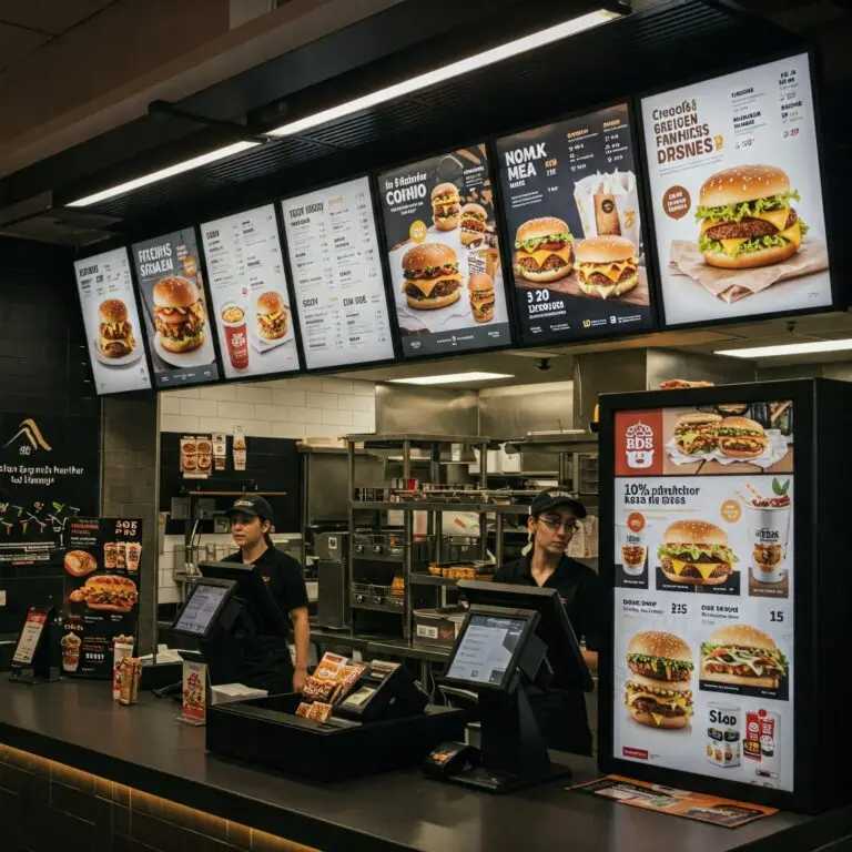
Imagine this: you pull up to a drive-thru and the screen greets you with a barrage of spinning burger animations, blinking “LIMITED TIME ONLY!” text, and six font sizes competing for your attention. You can’t find the coffee section. You panic-order the first thing you see. Or worse, you leave.
That’s not an edge-case. That’s Monday morning at half the QSRs in the country.
Let’s break down what’s actually happening behind the scenes:
-
Customer confusion = lower average order value
-
Longer decision time = slower lines = frustrated staff
-
Promos buried under visual clutter = lost upsells
A messy digital menu board, is basically a self-own.
Optimize Your Displays – Let’s Talk!
Designing Effective Digital Menu Boards: Best Practices
1. Logical Layout = Faster Decisions
If your menu layout feels like a treasure hunt, you’ve already lost the customer. Group your items into intuitive sections. Breakfast, Drinks, Sides, etc. and keep each panel clean.
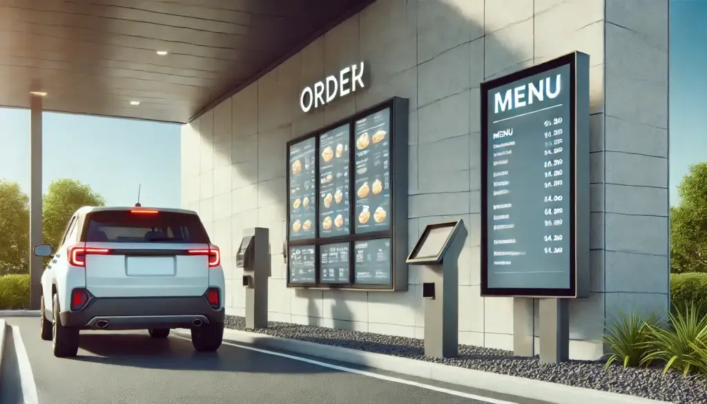
Pro tip: Drive-thru menu boards perform best when divided by meal part or category. One panel for combos, another for drinks, another for on-the-go items. No more scanning five seconds for a latte.
2. Fonts Shouldn’t Require Glasses
Your customers aren’t decoding ancient scrolls. Use legible, sans-serif fonts (Open Sans, Roboto, Arial) that read well from six feet away.
And no, you don’t need that edgy cursive typeface for your “handcrafted” breakfast sandwich. Save the personality for your social media captions.
Minimum font size: 30pt for indoor menus, 48pt+ for drive-thrus.
Contrast ratio: 4.5:1 at least. Accessibility isn’t optional.
3. Use Animations Sparingly (This Isn’t a Pixar Short)
Animations are like seasoning. Used lightly, they enhance. Overused, they ruin the dish.
Stick to:
-
Fade-ins for specials
-
A gentle pulse on limited-time offers
-
Smooth transitions between panels
Anything more? You’re distracting the viewer from what they came for: the food.
4. Spotlight High-Margin Items
Your mac & cheese bites? Gold. Your seasonal cold brew? Also gold.
Design your digital menu boards to guide eyes to those high-value items. Place them top-left (where most people look first) or dead center. Use slightly larger text, a distinct color block, or a spotlight-style frame.
But don’t overdo it! If everything is highlighted, nothing is.
Checklist: What Every Digital Menu Board Needs
Here’s your no-nonsense, conversion-driven menu board design checklist:
✅ Logical categories with clear headers
✅ Clean, sans-serif fonts (no Comic Sans, ever)
✅ Max 2 high-res images per panel
✅ Contrast-friendly, brand-aligned color palette
✅ Strategic placement for high-margin items
✅ Animations used sparingly and smoothly
✅ Core menu always visible (promos don’t replace it)
✅ Cloud-based CMS for easy real-time updates
✅ Compliance with accessibility best practices
Pin it. Print it. Live by it.
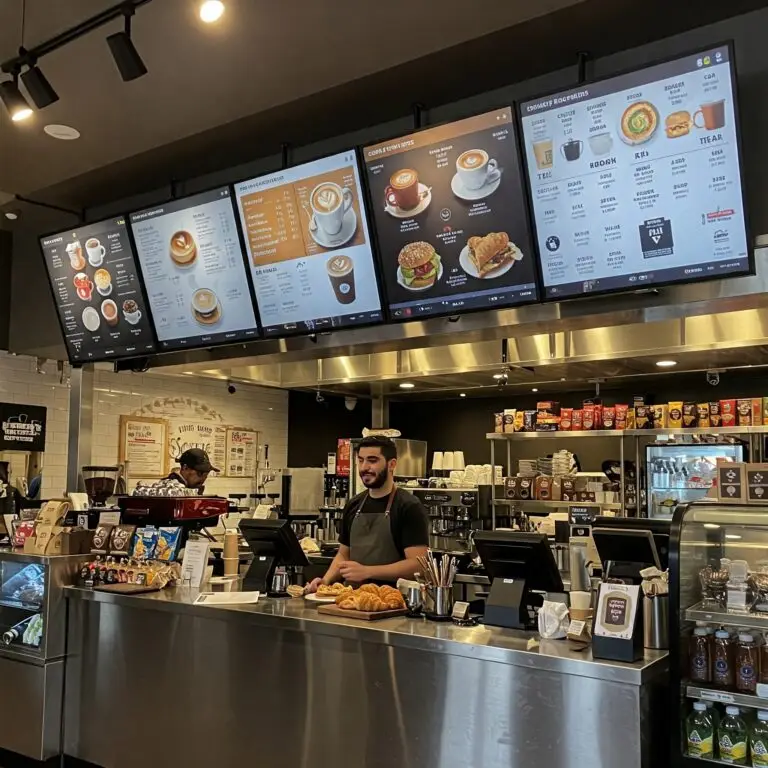
Real-Life Fix: Simplifying Saved This Café $
A few years ago, I helped a local café overhaul their indoor menu screens. They were crammed with customizations, prices for every drink size, and a wall of modifiers. Customers were paralyzed. Baristas were exhausted.
We stripped it down into three clean categories:
-
Customer Favorites
-
Seasonal Specials
-
Add-Ons
Bold headings. Large fonts. One or two crisp images per screen.
The result? Service time dropped by 30 seconds per customer. Sales of featured items jumped 25% in the first month. Staff morale went up. Nobody missed the 87 different milk options.
Now those are some digital signage stats to be proud of!
What Happens When You Get It Right?
Let’s look at the upside of doing digital menu boards well:
-
🧾 Higher ticket averages: Simpler menus = more confident choices = bigger orders
-
🚗 Faster drive-thrus: Clearer layout = shorter dwell time = more cars served
-
📈 Sales lift: Featured items get noticed, and sold
-
👁️ Better brand experience: Consistent design = trust = return visits
-
🧑🍳 Operational efficiency: Less explaining = faster service = happier staff
And best of all? The ROI is trackable. Restaurants with optimized menu screen layouts report 20–38% increases in sales of promoted items.
The Takeaway: Design for the Customer
That frustrating drive-thru experience taught me something important: Drive thru menu design be focused on serving the customer first. While it’s tempting to showcase everything your business offers, less is often more. Customers appreciate clarity, speed, and accessibility over flashy gimmicks.
The next time you’re reviewing your digital menu boards, ask yourself:
- Can a customer easily find what they’re looking for?
- Does the board guide them toward popular or high-margin items?
- Are the visuals and layout aligned with your brand?
Future Trends in Digital Menu Boards
Technology is advancing, and so are is digital menu board software. Here are a few trends transforming the industry:
- Interactive Displays: Picture a customer customizing their burger by selecting toppings and sides directly on a touchscreen. These displays not only enhance the ordering experience but also reduce errors.
- AI-Driven Recommendations: Imagine your menu boards suggesting hot beverages on a chilly day or promoting iced drinks during summer afternoons. AI adapts menus based on real-time data, driving higher sales.
- Sustainability Messaging: Highlight eco-friendly practices like locally sourced ingredients or waste reduction strategies. Customers appreciate brands that align with their values, and your menu board can reinforce that connection.
Final Word: Design for Customers, Not Committees
If you take one thing from this post, make it this: Digital menu boards should serve your customers, not your marketing ego.
No one needs flashing tacos or 14-button animations. What they need is to find their meal, fast. To feel good about the experience. And to maybe order that upsell item they didn’t know they wanted.
Keep it simple, keep it clear, keep it customer-first.
And if your current setup isn’t doing all that? Let’s fix it.
Need Help Making Your Digital Menu Boards Actually Work?
We specialize in turning chaotic, ineffective menu screens into sales-driving machines. Whether you run a nationwide chain or a single-location shop, we’ll help you simplify your signage, streamline your service, and sell more of what matters.
FAQ
What are the main advantages of using digital menu boards in restaurants?
Digital menu boards offer real-time flexibility, improved visual appeal, and better customer engagement. They allow restaurants to update pricing, promotions, and menu items instantly—without reprinting costs. Plus, eye-catching animations and high-contrast visuals help drive upsells and reduce perceived wait times at the counter.
Are digital menu boards worth the investment for small or independent restaurants?
Yes—especially when factoring in long-term savings and revenue impact. Many small restaurants start with affordable system-on-chip (SoC) displays and cloud-based CMS tools. This setup minimizes upfront costs while delivering the same benefits as enterprise systems. Over time, digital boards pay off through labor savings, reduced errors, and stronger brand presentation.
Can I manage multiple restaurant menus from one platform?
Absolutely. Modern digital menu board software lets you control multiple screens—or even multiple locations—from a single dashboard. This is especially useful for restaurant groups or franchises looking to maintain brand consistency while localizing promotions, pricing, or language per site.