From coffee shops to fast-food drive-thrus, digital menu boards have become a must-have for restaurants of all kinds. These dynamic digital displays simplify menu management, engage customers, and boost efficiency in an increasingly fast-paced industry. But these screens are more than just modern upgrades from static menus—they’re powerful tools to streamline operations, showcase mouth-watering visuals, and help customers make faster decisions.
Not all digital menu boards, however, are created equal. Some are cluttered with too much text, flashy animations, or endless promotional loops. While these designs might look impressive, they can frustrate customers when all they want is to see the full menu and order their favorite meal.
The secret to a successful digital menu board? Simplicity. When done right, these boards don’t just look good—they help your business thrive.
Why Simplicity Is Key for Dynamic Digital Menu Displays
Digital menu boards have one primary job: to guide customers in making quick, confident choices. Anything that complicates this—whether it’s excessive design elements or confusing layouts—works against their purpose.
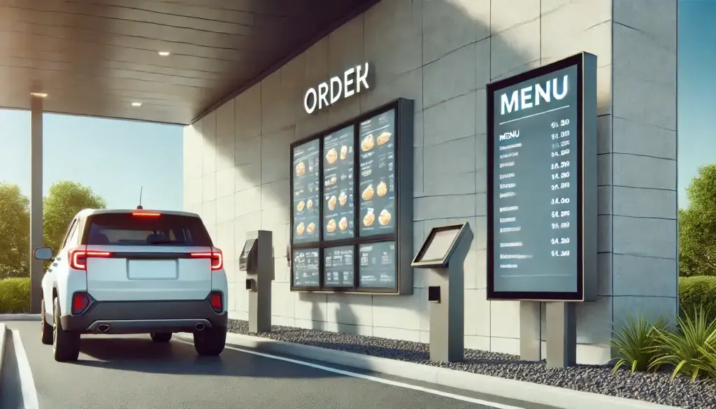
Picture this: You’re at a busy drive-thru, and the menu board is crammed with text, flashing animations, and promotional videos. Instead of placing your order quickly, you’re stuck scanning the cluttered screen, unsure where to focus. That frustration is exactly what simplicity in digital menu boards solves.
Here’s why keeping things simple works:
- Improved Readability: A clean digital menu display with legible fonts ensures customers can quickly find what they need, enhancing their overall experience.
- Faster Decision-Making: When choices are clear, customers spend less time hesitating and more time ordering.
- Enhanced Branding: Consistent, straightforward designs reinforce your brand identity.
- Operational Efficiency: Simplicity speeds up the ordering process, reducing bottlenecks during busy times.

Lessons Learned from Overcomplicated Digital Menu Boards
Years ago, I worked on a digital menu board project for a bustling café. The original menu board was overloaded with text—every drink size, customization option, and pricing variation was squeezed into a single display. The result? Confused customers, long lines, and frustrated staff.
My first recommendation was to simplify. We divided the menu into three sections: customer favorites, seasonal specials, and add-ons. Each section was easy to read, with bold headings, large fonts, and a few high-quality images.
The transformation was immediate. Customers could quickly locate what they wanted, orders moved faster, and staff spent less time explaining options. Sales of highlighted specials increased by 25% in the first month.
Designing Effective Digital Menu Boards: Best Practices
Creating a digital menu board that’s visually appealing and easy to navigate is both an art and a science. A well-designed menu board does more than just display your offerings—it enhances the customer experience and drives sales. Here’s how to ensure your menu board delivers maximum impact:
Prioritize Logical Layout for Effortless Navigation
Organize your menu items into clear, intuitive categories such as “Entrees,” “Drinks,” “Sides,” or “Desserts.” Logical grouping helps customers quickly find what they’re looking for, especially during peak hours.
Example:
For a drive-thru menu, dedicate separate panels to combos, breakfast options, and beverages. Highlight quick-grab items like “Snacks” or “On-the-Go Meals” to cater to busy customers.
Use Readable Fonts to Ensure Clarity
Your fonts must be easy to read at a glance and from a distance. Stick to clean, sans-serif fonts like Arial or Open Sans, and avoid overly decorative or script-style fonts that can confuse customers.
Pro Tip:
Maintain a contrast ratio of at least 4.5:1 between your text and background to meet accessibility standards and improve visibility under various lighting conditions.
Keep Animations Dynamic Yet Subtle
While animations can draw attention to specials or limited-time offers, overusing them can distract from the menu itself. Use smooth transitions or gentle highlights to guide the eye without overwhelming the viewer.
Best Use of Animations:
- Fade-ins for featured items.
- Subtle glowing borders around limited-time promotions.
- Smooth scrolling for secondary menu panels, like dessert options.
Incorporate High-Quality Visuals
Nothing entices a customer more than a beautifully captured image of your best-selling dish or beverage. Invest in professional food photography to showcase your offerings. Keep visuals crisp and vibrant but avoid overcrowding the screen.
Tip:
Limit your menu to 1-2 images per panel to maintain focus and prevent visual clutter.
Stay True to Your Brand with Consistent Design
Your digital menu board should reflect your brand’s identity. Use your restaurant’s logo, brand colors, and signature aesthetic to create a cohesive experience across all customer touchpoints.
Example:
If your brand has a rustic theme, incorporate earthy tones and wood-textured backgrounds. For a modern café, opt for minimalist layouts and clean lines
Highlight Specials and High-Margin Items Strategically
Guide customers toward your most profitable items by giving them prominence on the menu. Use larger fonts, bold colors, or highlighted sections to draw attention.
Pro Tip:
Place high-margin items in the top-left or center of the menu—areas where the eye naturally gravitates first.
Make Content Updates Simple and Quick
Your menu should adapt to changing times of day, inventory levels, and seasonal specials. Choose digital menu board software that allows for real-time updates with minimal effort.
Example:
Automatically switch from a breakfast menu to a lunch menu at 11 a.m. without requiring manual intervention.
Checklist: Designing a Perfect Digital Menu Board
- ✅ Group items into clear categories.
- ✅ Use clean, sans-serif fonts that are easy to read.
- ✅ Incorporate subtle animations to guide attention.
- ✅ Limit visuals to 1-2 high-quality images per panel.
- ✅ Align colors and design with your brand.
- ✅ Follow accessibility guidelines for contrast and height.
- ✅ Promote specials and high-margin items strategically.
- ✅ Use software for quick, real-time updates.
By following these best practices, you’ll create a digital menu board that not only looks great but also enhances the customer experience, drives sales, and streamlines operations.

What Overcomplication Costs You
When digital menu boards are cluttered or overly complex, the consequences are immediate and costly:
- Customer Frustration: A confused customer is less likely to make a purchase or return.
- Longer Wait Times: Indecision at the counter or drive-thru slows down service for everyone.
- Missed Opportunities: Overloaded screens can bury your most profitable items or specials.
The solution? Dedicate a portion of your screen to always display the full menu. While promotions are important, they should complement—not replace—the primary menu.
Benefits of Simplicity for Your Business
When digital menu boards focus on simplicity, the benefits go beyond customer satisfaction. Here’s how a streamlined approach can boost your business:
- Increased Sales: Restaurants using simplified digital menu boards report up to a 20% boost in sales of featured items, thanks to clear and compelling calls to action like ‘Try Our New Spicy Burger!’
- Better Branding: A clean, well-designed board reflects professionalism and attention to detail.
- Effortless Updates: Simple layouts are easier to update, saving time and reducing errors.
The Takeaway: Design for the Customer
That frustrating drive-thru experience taught me something important: Digital menu boards should always serve the customer first. While it’s tempting to showcase everything your business offers, less is often more. Customers appreciate clarity, speed, and accessibility over flashy gimmicks.
The next time you’re reviewing your digital menu boards, ask yourself:
- Can a customer easily find what they’re looking for?
- Does the board guide them toward popular or high-margin items?
- Are the visuals and layout aligned with your brand?
Future Trends in Digital Menu Boards
Technology is advancing, and so are digital menu boards. Here are a few trends transforming the industry:
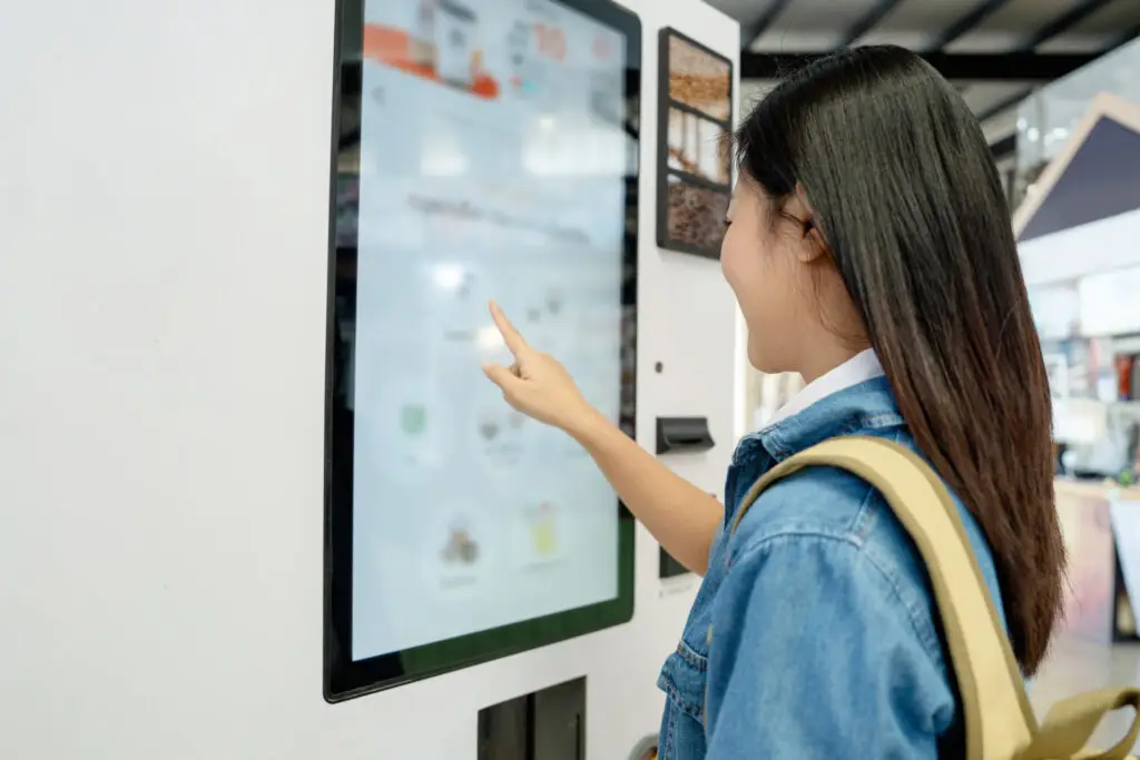
- Interactive Displays: Picture a customer customizing their burger by selecting toppings and sides directly on a touchscreen. These displays not only enhance the ordering experience but also reduce errors.
- AI-Driven Recommendations: Imagine your menu boards suggesting hot beverages on a chilly day or promoting iced drinks during summer afternoons. AI adapts menus based on real-time data, driving higher sales.
- Sustainability Messaging: Highlight eco-friendly practices like locally sourced ingredients or waste reduction strategies. Customers appreciate brands that align with their values, and your menu board can reinforce that connection.

Ready to Simplify Your Digital Menu Boards?
Your menu isn’t just a list of items—it’s your chance to make a great first impression. With dynamic digital menu boards designed for simplicity and customer needs, you can create a seamless experience that keeps diners coming back. Start designing smarter menus today and watch your business thrive.
Whether you’re running a fast-food chain, a cozy café, or a fine-dining establishment, the principles are the same: Keep it simple, make it clear, and always prioritize your customers’ needs.
Don’t let outdated menus hold your restaurant back. Upgrade to dynamic digital menu boards today! Contact a digital signage consultant for tailored solutions that simplify your menu, boost customer engagement, and drive higher sales.
FAQ
What are the benefits of digital menu boards for restaurants?
Digital menu boards enhance customer engagement, improve readability, and allow real-time updates for changing menus or promotions.
How can video content be used without it being distracting?
Videos can make digital menu boards more engaging by showcasing promotions or specials, but they shouldn’t take over the screen. It’s best to keep videos in a small section while leaving the main menu visible. Short video loops and avoiding full-screen displays ensure customers can quickly see the menu, balancing eye-catching digital signage content with practicality.
What are the best ways to manage digital menu boards across multiple locations?
Consistency is key to building brand recognition. A centralized content management system (CMS) helps businesses update and sync digital boards across all locations, keeping brand standards intact. At the same time, it allows for local updates, like regional specials. With a centralized CMS, scheduling and real-time updates are easy, making it simple to roll out seasonal changes or promotions while maintaining a uniform look and feel.


